Categories
Practice Blog

Trial Post

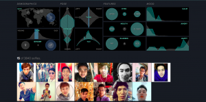
The first sample DH project I chose was “selfiecity.” The DH project takes a look at people taking selfies and its goal is to find common themes and trends throughout the images. The primary focus of it is visualization because it used imageplots to display the thousands of pictures to reveal the results of the findings. The study categorizes the pictures into what types of people take selfies, what their poses are, and what their expressions are. It compared people taking selfies in numerous cities worldwide and then further compared gender and age. Crowdsourcing was a secondary approach used on “selfiecity” because 3200 photos were used to determine and reveal the patterns. The visualization method fits perfectly with this scholarly subject matter because photos, something visual, were being analyzed, so it makes sense that the results were displayed visually. Since this project takes the selfies of individuals from numerous different countries into consideration, displaying the results visually make it easier for everyone involved to understand the results. It helps eliminate the language barrier that could occur if it was displayed in a different manner.

Due to the use of visualization approach to reveal the results of the project, it makes it easier to narrow down searches to a certain age, gender, country to compare results.


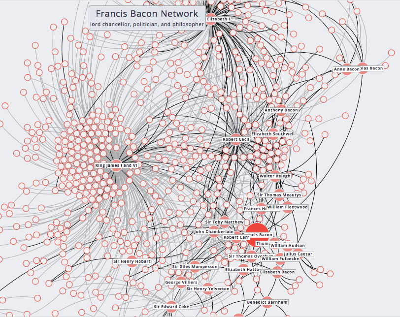
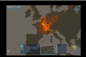
The Mapping of the Republic of Letters uses data visualization to understand the correspondence of networks. When specifically looking at Voltaire, visualization is used to see his correspondence and to understand his connections to certain people and places. The method used fits with the subject matter because looking at letters and other historical archives used in this process makes the connections very clear and easy to see where his ties are to. A map is used to connect the countries which is best for understanding this specific type of information because the study is discussing the ties between countries all over the world. Those looking at the work will immediately be able to tell where most of the communication took place.


This visualization shows the number of letters sent/received from Voltaire between a specific time period.
Categories
Practice Blog

Visualization and Preservation

The primary focus of Adrian S. Wisnicki’s project, Livingstone’s 1871 Field Diary, is preservation. Due to not having the proper technology, David Livingstone’s field diary had remained unpublished and inaccessible. By using spectral imaging and processing technology, the project team was able to decipher what was written in the original diary. Preservation is one of the most important topics when dealing with digital humanities. If we are not able to preserve the old texts, then we will never be able to transcribe them, meaning we will never get to read them. Preservation does not come with just old diaries, such as in the case of David Livingstone, but also with historical maps and records.

The primary focus of the project, Selfiecity, is visualization. By obtaining selfies from thousands of people worldwide and compressing them into a collage, it becomes possible to analyze demographic patterns of selfies. It may seem unnecessary to study selfies of people, but interesting findings have come out of the project – one finding being happiness. Of the cities studied, Bangkok has the highest ‘smile rating’ with 68% of selfies being smiles whereas Moscow had a 53% smile rating. In a study of social media patterns, it was very smart for the Selfiecity group to use the visualization method. Currently, Snapchat and Instagram comprise a large portion of social media where both medias are about posting or taking pictures of yourself. It would be much harder for Selfiecity to explain their findings if they did not have photographic evidence to back up their findings.

Categories
Practice Blog

Bhagawat’s Practice Blog

The Six Degree of Francis Bacon project was founded by professors at Carnegie Mellon. It creates a network map for Francis Bacon, these people he knew or worked with. Through these networks, we are able to not only see how they are connected to Bacon, but also see their own networks. It allows us to see the shared network between people as well as a personal network of people such as King James I. The primary digital humanities focus of this project is visualization as it allows us to see the network and select different people and things. This project does use crowdsourcing as well as a statical analysis to find these connections. People can contribute information and connections to the project to make a more dense map of the connections. The perfect choice to display relationships between a large group of people is a network map. The connections represent the relationship between Bacon and others in an understandable manner.

Francis Bacon Network


Jane Austen Fiction Manuscripts

The Jane Austen Fiction Manuscript is a project that preserve and archive Jane Austen’s fiction writing. It allows readers to see the writing in her own handwriting as well as a digital version. This project preserves and digitalizes the writings, making it easier for readers to access the writings. It brings all of the scattered collections to one place. It collects rare readings that are in libraries and private collection and allows anyone to read them. This way of archiving and digitalization works perfectly with the writings as it allows for more readers to have access to it.

Categories
Practice Blog

Practice 8/28 – Tyler George

My first digital humanities approach I chose to look at is mapping, by observing the Map of Early Modern London (https://mapoflondon.uvic.ca/agas.htm) page created by many members, who were lead by Janelle Jenstad, Martin Holmes, and Mark Kaethler. This map is designed to streamline the information found in encyclopedia, library, and stow editions all into one place with an easy user interface. Primarily this map is an example of textual analysis, by bringing hundreds of texts together to provide the viewer a streamlined overview of each particular area, while also providing the information to dig deeper into their research should they choose. The map is also an example of visualization, while also preserving and analyzing the areas of historical London. This is a great way to do this because maps provide a much more clear representation of what London actually looked like than you would ever find in a typical textbook. This interface allows us to visualize great amount of historical information in an accessible way. Easy to use, this map allows me to zoom in on a location, click on it and provides vast information on that location. Additionally, you can sort by category and pull up any locations relating to that category with ease. This map revolutionizes the way users view maps and find certain things in London. Not only does it show me the location of each place, it provides historical context as well as hundreds of articles about each place. This is easily the best interface for viewing a map, as it is easy to search for or find new places, and provides more information on each place than possible to find anywhere else. Lastly, this map is able to include where each piece of information came from, making it easy to verify the authenticity of their information.

.


Another interesting website I viewed is titled Selfie City (http://selfiecity.net/#) coordinated by Dr. Lev Manovich, by there help of several contributors. This site provides image plots trying to categorize the commonalities of selfies in particular areas. This is a clear example of visualization, define by Johanna Drucker as “a methodological reversal which makes visualization a procedure rather than a product and integrates interpretation into digitalization in a concrete way”  (Whitley reading). This site uses image analysis to relate themes between selfies, for example the tilt of photos, use of glasses, age, gender, etc. There is definitely no better way to find information regarding selfies by region than through their technology used that closely examines each image. One interesting stat found was that Sao Paulo females tilt there head on average 17 degrees in their selfies compared to Moscow males who average a 7 degree tilt. This is a very interesting stat that I would never have previously thought possible without the use of this technology. Their automated analysis of images allowed them to recognize just the smallest details that would’ve taken forever to browse through so many photos with just the human eye. When examining photos, this is truly a remarkable discovery that will revolutionize the way we study images.