Categories
Blog #1

Blog #1 – Caleb Broughton

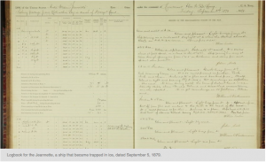
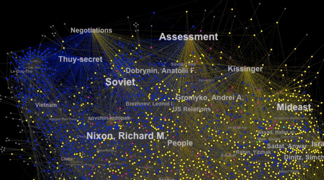
Often times when historians are analyzing an archive, specifically one that is large in size and may take a long time to analyze fully, they run into some trouble with a term that Micki Kaufman uses in her project Quantifying Kissinger; “information overload.” This over abundance of information usually requires multiple different tools and methods for analysis, and when historians are working on this for hours at a time, the work can become tedious, frustrating, and sometime unproductive. This leads to spending more time looking at a screen and figuring out how to use certain methods and tools, rather than focusing attention on the physical archive itself.

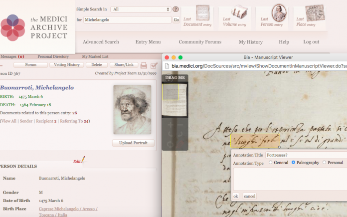
Creating a digital artifact from archival documents gives way to so many advantages. First of all, the majority of archival documents are in rough condition, and are very fragile to the touch. If digital artifacts were not a thing, most of what we know about history from these archival documents would be unknown. Some documents are illegible to the human eye but with technology, historians are able to recreate a lot of these archival documents.

Image result for archived documents digital humanities

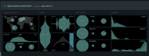
I think it is true that our physical and emotional relationships to our objects of study are shifting as we move deeper into a digital age. I think they are getting stronger and more intelligent, because a lot of the content that is being created connects directly to our natural human instincts, and can be very beneficial for people. As Whitley says in his paper, “Humans are quite adept at perceptual visual cues and recognizing subtle shape differences…humans are pre-wired for understanding and visualizing shape.” Because of this natural ability that humans possess, these digital tools that transform textual patterns into visual shapes naturally help people grasp certain skills of shape perception. There is even speculation that because this portion of the mind is being activated by these digital tools, it could potentially be accelerating the reading process.Image result for textarc

Whitley talks about creating these things called “concept shapes” out of texts,  to graphically represent data patterns. In order to better understand the content of a document, a group of scholars came up with a method for representing texts as “semi-spherical objects in a virtually rendered three dimensional space.” Wherever there are patterns in the text, the spherical objects “blend together to create a variety of quasi-organic shapes.” This method is one that seeks to help readers identify different patterns that would otherwise be overlooked if it was in a large body of text. For this, I believe it is true to say that digital versions of material texts highlight physical elements of texts that might otherwise pass unremarked.

One way to create online reading interfaces that can more closely approximate the experience of reading physical materials, that Whitley talks about in his paper is TextArc. It is an experiment in spatial reading, and is based off of the idea that seeing and reading are two complimentary processes. Whitley describes it basically as a “balancing act between reading and seeing.” As people are experiencing the text visualization, the eyes and the mind “scan for ideas, then follow the ideas down to where and how they appear in the text”.


Categories
Practice Blog

Practice Blog

http://thehumanitiesnow.blogs.bucknell.edu/files/2014/08/Screenshot-2014-09-03-07.38.49.png

I chose to explore network analysis and archive for this assignment and found two sources that I found to be very interesting. Essentially, one is an “Old Weather” log used for the purpose of analyzing past weather. The second source, selfiecity, is used to provide information on the dynamics of “selfie taking.” The primary DH focus of the website https://www.oldweather.org, categorized under the archive section, is to help readers understand ship and weather logs from the 19th and early 20th centuries. It is important because it provides information that could assist in the understanding of future climate change by exploring past weather patterns. The primary DH focus of the second website http://selfiecity.net/#, categorized under the network analysis section, is to explore the art of “taking selfies” using quantitative methods. It takes into account peoples poses and expressions and arranges them in a method that identifies patterns from the data collected.

http://selfiecity.net/selfiexploratory/

The secondary approach addressed for the first project is preservation. This method fits with the scholarly subject matter because it could be used to help develop methods that assist in the preservation for our planet and environment. We can look at what this means for the future based on the past. In comparison to that, the secondary approach addressed for the second project is visualization. This fits with the scholarly subject matter because it provides a visual of the information that was gathered. There are images of selfies containing different subjects with different poses and facial expressions. They are then separated based on demographics, pose, features, and mood. The data collected was then formed into numerous graphs and when clicked on, selfies would pop up. Both of these sources use a medium of the subject matter that is both engaging and relevant for digital representation. The Old Weather uses ships to show ship logs to show data in the form of digital representation, where as selfiecity uses selfies to show this.

Categories
Practice Blog

Megan Koczur’s Practice Blog

The primary digital humanities focus of the project, Jane Austen’s Fiction Manuscripts, is digital edition. The author speaks directly of digitalization and provides photos of Jane Austen’s prints as well as the transcribed versions. There is a tie for the secondary digital humanities focus of Diane Jakacki’s project between archive and preservation. In order to analyze an archive years after being created, historians need to preserve it. Without different forms of preservation, the frail scripts would not be decipherable. The historians need to put forth ample amounts of time in order to clearly understand these scripts and transcribe them for readers. The digital representation used in the article is helpful in showing the readers the frailness of the scripts but also giving them the ability to analyze them on their own with the addition of the transcribed prints.


https://janeaustensworld.wordpress.com/2010/01/01/a-womans-wit-jane-austens-letters/


The primary digital humanities focus of the project, Six Degrees of Francis Bacon, is network analysis. The creator provides researchers with a detailed diagram of Francis Bacon and his several connections. The link provides the researcher with direct connections as well as indirect ones. The second digital humanities focus of this project is visualization. The creator provides researchers with a visual network making it easier to analyze the relationships. By clicking on the dots, one is able to determine the person, their title, and the time they were alive. One also has the ability to click the visualize tab which orients the network around a specific person. The reader then sees the connections to this specific person. Users can also click on the lines and determine the confidence rate at which these two people knew each other as well as when their time alive overlapped. The different dots in the network represent direct and indirect connections. Historians put ample amounts of time into research and sorting in order to create this detailed network so readers can easily understand and analyze the connections. The digital representation used is vital in giving the readers a clear diagram of the numerous connections of Francis Bacon as well as many others.


https://www.biography.com/people/francis-bacon-9194632