Categories
Practice Blog

Jules Kim 8/28/18

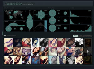
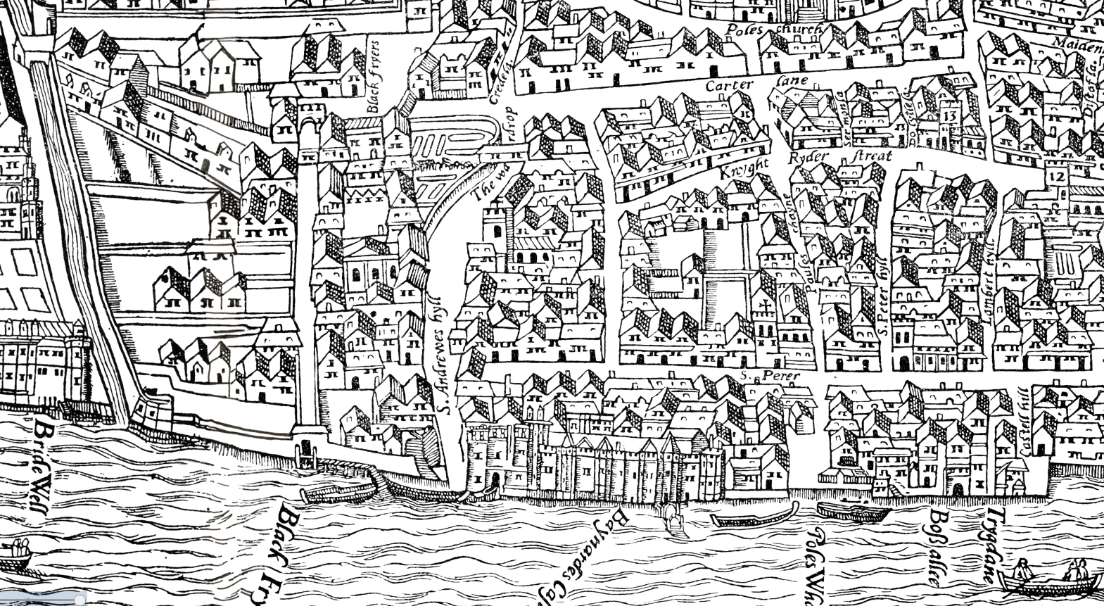
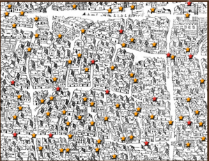
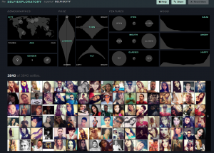
One of the DH sample projects I looked at was SeflieCity which uses network analysis and visualization to study demographics and patterns of the subjects and their images. Because the images were collected from Instagram,  a social media platform solely dedicated to images and videos, it makes sense to use Imageplots to assemble the pictures together to compare them one city at a time. This compilation helps the reader see the similarities and differences between all the different facial expressions of the subjects.  Beside a collage of pictures, the project also shows line graphs and charts to organize age, gender, poses, facial features, and moods. The project also incorporates a map of all the cities to help the reader visualize where the subjects are in the world and the extent to which Instagram can expand one’s network on a global level.

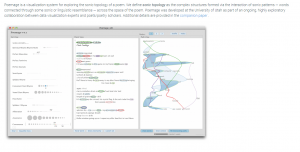
The second project I looked at was done by the University of Utah on the study of sonic and linguistic connections between words in text like poems, otherwise known as sonic topology. The usage of textual analysis is logical here because the study is based on texts. The words in an example of a poem are circled in different colors, depending on the category like identical rhyme, perfect masculine, perfect feminine, syllabic rhyme, alliteration, assonance, consonance and others. The examples are  annotated in the manner of close reading, focusing on word choice and phrasing to identify imagery, sound, metaphors to determine the meaning of these texts. There is a graph of words connected to each other by lines based on similarities in the previously mentioned categories. 

Categories
Practice Blog

Practice

One DH project I found interesting was called, “Old Weather”. Its primary Digital Humanities focus was to preserve and archive information from old logbooks of whalers and Arctic voyagers in order to understand the weather of the past.  It also had a secondary approach and also involved textual analysis. Once pages of old logbooks were archived, they were then transcribed. These two methods to organize the information fit the scholarly subject well, because the pages from logbooks are easy to find and the transcriptions make it easier to understand what we are looking at.  Since some of the pages date back to the mid-19th century, they do need to be preserved and archived in order to save the information, especially since they are written on paper. Transcription and textual analysis are also necessary in order to understand what is actually written down since some pages can be too hard to read in their current state.  


Another DH project is called, “Mapping the Republic of Letters”. This project is a network analysis project that aims to map out how communication by letter had changed throughout history. The project looks at people from Voltaire and Galileo, to the Spanish empire, and works to show how large their network of communication was. It also used visualization to show how how many letters were sent by a particular person, and graphs to show where the letters went to geographically, and who they were received by.  The graphs and images are really helpful to show just how far publications traveled, or to show how limited people in the past where to spreading their works. Since the information the project was looking at were letters that had to travel to other places, the visualization approach does a great job at communicated the difference between communication today and the past.

Categories
Practice Blog

Practice Blog 8/28- Carly Pavoni

I explored visualization and mapping as sample projects of digital humanities. Visualization is an important aspect of digital humanities because “digital visualizations will accelerate the reading process by allowing readers to access that portion of the mind that processes information spatially rather than sequentially (“Visualizing,” 445). SelfieCity is a modern digital humanities project conducted by Dr. Lev Manovich. It is a project used to explore the demographics, expressions, and positions of selfie takers. Visualization is used in the SelfieCity project in order to efficiently display information to an audience through graphs, charts, and collages. The collage of pictures used to show the different poses, separated by city, makes it very easy to draw conclusions about the popularity of poses per each city. SelfieCity also uses graphs to display the gender and expressions of the selfie takers. This makes it easy to read what is more popular among certain demographics.

SelfieCenter visualizations
MoEML

In the project The Map of Early Modern London mapping is used to display a reliable map that was put together from four sources. Digital mapping puts together a visual image “whose meaning can be quickly apprehended by the brain’s natural propensity for spatial recognition” (“The American Literature Scholar in the Digital Age”, 194). This visual map allows students and researchers a gate to continue inquiries relating to early modern London that wouldn’t have been accessible before. This will allow us to learn more about London’s history. This mapping is a form of visualization that doesn’t require words, therefore our brains can process this information quickly.

Categories
Practice Blog

Paige’s Trial Post

This shows some of the different locations one could click on to compare the different selfie styles. This specific picture shows all the different selfies taken in each location, which I find very interesting because it is so popular in today’s society.

In the project, selfieCity, the primary digital humanity focus is visualization. It is a combination of selfies that have been taken by people from all different cultures and society’s all around the world. Each selfie shown is very different and unique; each person looks different and has a different way they take a selfie. For example, some people smile in their selfies and some make duck faces. The angle the photo is taken also differs from selfie to selfie. This project allows us to see up to 3200 photos within a short amount of time and to capture the idea that the norm of taking a selfie changes based on where you are from. A secondary approach in this project may include crowdsourcing because the viewer obtains a large source of important information within a short amount of time. It makes sense that Visualization is an efficient way to portray such subject matter because selfies taken from around the world is the best way to see the differences in society and culture. It is a more engaging way to understand than for one to explain through words.

Visualization was also used in the second project I viewed, Map of Early Modern London. A secondary approach is also crowdsourcing because the project offered a location by category bar that allowed me to easily look up important locations on the map. I was able to obtain information quickly and efficiently about what London looked like through a visual field. The project gathered information from five encyclopedias and condensed it into a more fun style of learning. It offered me information on the people, the streets of the city, lifestyle, etc. The digital representation was helpful because the subject matter is about a city. People tend to be more engaged and understand material better if you have a visual sense of what the city looks like and have easy, quick access to the important material, instead of reading long, detailed articles.

This map shows part of Early London. In different colors based on the category, important locations are pin pointed. If interested, you can then press on the location and get the important information on the certain location. This prevents one from having to read through a very long text to find information on one location. It is quick and efficient.