Categories
Practice Blog

Different uses of DH

The Stanford Geospatial Network Model of the Roman World provides the viewer with an understanding of the routes in which Romans were able to move around through such a vast and environmentally restrictive area. This project was designed by Walter Scheidel but wouldn’t have been possible to execute without the help of Elijah Meeks, Karl Grossner, and Noemi Alvarez. The primary DH used would be visualization/mapping. This site provides the viewer with a map of Rome and the various roads, rivers, coastal sea routes, and open sea routes that were used during the early common era. You can also sort the data by the season, the terrain travelled, the length, time, or cost used for certain routes. There is no secondary approached used in this project because visualization/ mapping is really the only approach that makes sense for this subject matter. The goal of the site was to visually show the viewer the modes in which Romans used to travel such vast lands, and therefore, creating a map was the most effective way.


The SelfieCity uses a primary DH of visualization. The project relies on compiling images from certain areas and creating a grid filled with all of the selfies from that area. The grids are organized by head tilt and the direction in which their eyes are facing. Therefore, to create these grids the only logical way to display your findings is through visualization. The evidence shows many different statistics on the pictures analyzed. It focuses mainly on gender, location, emotion, who took the picture, and age. Only around 4% of the pictures collected were actually selfies. The data also shows that the majority of people featured in these pictures were women. For example, in Bangkok 55.2% of the people taking selfies were women and in New York 61.6% were women. Finally, the data shows that more often than not the people featured in the pictures are young. People in Bangkok and San Paulo smile more than Berlin, New York, and Moscow. The poses made in the pictures are dependent on gender. The data shows that women strike more extreme poses than men. Due to the manner of the study being based on picture there is no secondary DH and strictly shown through visualization.


Categories
Practice Blog

Practice Blog

The first topic I chose utilizes visualization to analyze/organize a subject that has already been textually analyzed. The DH Project seeks to organize and structure words/phrases that are of importance in the released documents that pertain to Henry Kissinger’s time in the US State Department. The author creates this structure through a color code that organizes the subjects from these documents into SECRET and TOP SECRET and utilizes a timeline to provide historical relevance to these subjects. So, because of this structure, the project also utilizes the technique of mapping in time. For example, the TOP SECRET topic of Triangular Diplomacy can be related to the talks between China, Russia, and the US during the Vietnam War because of the background on time that the timeline provides. This DH Project offers us a way to analyze documents on one medium in a convenient way. Otherwise, it would be a monotonous task, involving sorting through thousands of pages of documents, to analyze Kissinger’s time as Secretary of State. The subject matter didn’t necessarily need to be presented visually; words and phrases could have. been mapped to the areas that they pertained to in the world. I think the author just came to the conclusion that visualization was the most convenient way to organize the information and the easiest for readers to understand.

Military men are just dumb, stupid animals to be used ...

The second topic I visited utilizes mapping. This “map” displays the relation of words based on our understanding of them through metaphors that have developed in the English language in the past millennium. Because the map also provides a visual display, you could say it is also a method of visualization. This project perfectly displays the advantages that come with Digital Humanities. You would have to research an endless number of texts and compare them in order to completely understand the impact that metaphors for over a millennium have had on words and the way we understand them today. I feel that mapping/visualization is the proper technique for this topic because it not only provides a good structure, but it also makes reading it more fun.

metaphor


Categories
Practice Blog

Analyzing DH Projects

I decided to focus on two of the sample DH projects: Jane Austen’s Fiction Manuscripts and the Belfast Group Poetry. The primary DH focus for Jane Austen’s Fiction Manuscripts seems to be preservation and archiving and the secondary focus is digital edition. These DH focuses were definitely the best methods for this type of subject matter. The website houses the original text through photos and it provides a transcribed version for an easier read. This is a great way to preserve the original writing while also creating a digital copy. Anybody worldwide can read Jane Austen’s manuscripts, the digital edition of these materials increases accessibility. Given the age and the fragility of Jane Austen’s physical text, archiving and digital edition is a no brainer.

A page of Jane Austen’s fiction in its digital form; it includes a photo of the original text with the transcribed digital edition.

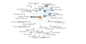
The Belfast Group Poetry’s primary DH focus is networking and mapping. However, visualization plays a big role in this site as well, and can be considered the secondary DH focus. The Belfast Group refers to a weekly writing workshop founded by Philip Hobsbaum around 1955 and this project primarily uses networking maps to show all of the people that were involved in this group. Mapping and using visualization is definitely the best way to share this information. Instead of just simply listing who was involved and attended these workshops, the networking maps provide an interactive and exciting visual aid that displays all kinds of information. There are maps that show simply how these people were connected, there’s another one that shows who was involved with the group over the two time periods that the Belfast Group was up and running, and yet another that shows where the group members lived and worked. Since the main point of the site is to show the interconnections between group members, mapping these connections is the easiest way to represent the data.

One of the networking maps from Belfast Group Poetry that shows the people who were connected to this group.
Categories
Practice Blog

Nathan Ware’s Practice Blog

As discussed in the Whitley reading, there are advantages to both traditional literature and today’s textual visualization technologies. While reading literature, a reader is encouraged to read more closely, paying attention to what the author is trying to allude to. This style of reading is great for reflecting on the details of a text in order to form your own interpretations. However, in a text that is sophisticated and long, readers can suffer through a bottleneck syndrome. When complex themes sequentially accumulate, the reader becomes easily overwhelmed. Therefore, using graphing technologies to create a visual representation of text can adhere to a person’s natural capabilities to recognize shapes and patterns. In Micki Kaufman’s project “Quantifying Kissinger”, Kaufman wanted to create a digital national security archive that would make analyzing large archives easier and more convenient for historians. The picture below presents a static text plot that displays tendrils of specificity that shed light on patterns of specific words. This information allows the viewer to visualize data in a way not available to the naked eye when just viewing text.

Using similar visualization technologies, the Belfast Group connected many authors in North Ireland with their writing workshop. Although this group unfortunately stopped meeting in the early 1970’s, their work is still studied in the present. To give a specific example, students in Emory University created a “Manuscript, Archive, and Rare Book Library” that has a large collection of their poems. Through this database, the “NameDropper software” was created, which allowed computers to make sense of the people and places mentioned within the group’s poetry. Once this information is represented graphically, the viewer can visualize the relations between each member of the group. In the example below, one can infer from the proximity of one author from another that some had more connections with specific members than others.