When Professor Faull first introduced the final project and mentioned that we would be using WordPress to create a website, I was instantly excited. I was already somewhat familiar with the platform from a past course I had taken and I couldn’t think of a better way to culminate my group’s research. The website allowed my group and I to represent the entirety of our research in a cohesive manner being that we were able to embed all of the tools we used in a single place.
Although I had used WordPress in the past, creating the website allowed me to refamiliarize myself with the platform and learn how to use it again alongside my groupmates. Each member of our group had a varying level of comfortability with using technology. Out of everyone in the group, Brendan is definitely the most tech-savvy, so he took the lead in creating the site. Our group had worked out a nice method that would allow us to split the work evenly between ourselves. Although Brendan was the main person “publishing” onto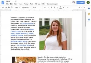 the site, Ethan, Olivia, and I still had a strong hand in the creation of the site. Specifically, Brendan led the group in delegating the parts of the website each person was responsible for. Each person would then gather the information from past modules or create the information that was necessary for the section. For example, each person was responsible for writing their own personal bios and to provide a picture, which we all put into a Google Doc to make it easy for Brendan to then copy onto the site.
Our website consists of a static homepage that introduces our research question along with nine subsections which include an About page, List of Memoirs, Tag Frequencies, Timeline, StorymapJS, Voyant, Documentation, Moravian Music, and Works Cited. It was important to introduce the research question “Was the 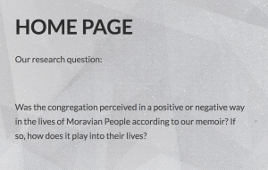 congregation perceived in a positive or negative way in the lives of Moravian People according to our memoir? If so, how does it play into their lives?” first because we then move to analyze and answer the question with various tools.
The following two sections help the viewers of the website to familiarize themselves with both the project and the researchers. We provided an About the Transcribers section to help the viewers better understand who we are as people. By providing a bio about ourselves, we invite the reader to understand why we may have analyzed 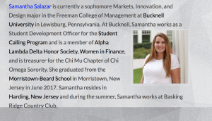 something a certain way. This speaks to Bodenhamer’s point that, “all perspectives are particular and dependent upon experiences unique to an individual, a community, or a period of time” (Bodenhamer,14). Next, The List of Memoirs allows the viewers to see whose memoirs we are analyzing by providing a list of names of our Moravians.
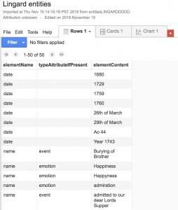 Our next section of the site is Tag Frequencies, which links to our Google Fusion Tables. This section allows the viewer to explore the entities of each of our Moravians which were extracted in prior modules. Specifically, if you were to click on Joseph Lingard, you are able to view a chart that shows what I had tagged in Oxygen. These tags included dates, person names, and even health updates.
The next section embedded our timeline that we created in TimelineJS into the site. This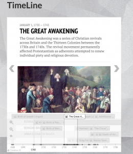 particular section is cool because it allows the viewers of our site to examine how our Moravians may have overlapped in both time and space. This is shown because our group was able to create a stacked timeline, which allows for our Moravian’s timeline to be viewed as a whole. The timeline section allows our Moravian’s lives to be viewed as a unique story or as Grafton puts it, “ [timelines] translate wonderfully from weighty analytic history books to thrilling narrative ones” (Grafton, 10).
Following TimelineJS, we added a section for StorymapJS. In this section, you are brought to a page of all the names of our Moravians 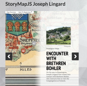 and the viewer is able to click on a name and be brought to their story map. The story maps allow the viewer to see how the Moravians traversed time and space on handpicked maps. For example, for Joseph Lingard, the viewer is able to see the massive distances Joseph traveled in the name of religion, illustrating the immense importance the congregation had in his life. Although the timelines showed how our Moravian’s stories overlapped, the storymaps illustrate that they were unique people and help to portray their individual journeys.
Next, we dedicated a section of the site to the very first tool we used in the course, Voyant. This tab brings the viewer to a description of each of the visualization tools we used, then can be clicked on to see how our corpus is interpreted. For example, Textual Arc shows how the words in our corpus are connected by creating flowing arcs. By 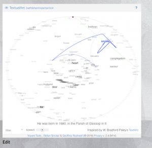 using the visualization tools in Voyant and including them in our site, our viewers are able to better understand our memoirs without actually needing to read through. This speaks to Whitley’s point that, “The virtue of information visualization is that it can make complex data sets more accessible than they otherwise might be” (Whitley, 188).
Our Documentation tab allows the viewers to see which applications were utilized and provides a short description for each. This will help the viewers to better understand the tools we used if they are not already familiar with them. Next, We added the Moravian Music section to differentiate our site from the other’s in the class. This tab allows the viewer of the site to listen to some samples of music that the Moravians may have listened to. We did this by exploring some of 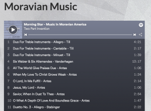 the playlists available on Spotify, to which we surprisingly found a playlist called “Moravian Music”. This section allows the viewers of the site the unique chance to better understand the Moravians and walk in their shoes. Lastly, our Works Cited section allows for our viewers to recognize the all the sources we used in creating our site.
In sum, I feel that our website was a great way to show off all our hard work from this semester. The site also serves as a reminder of how much I have learned over the past semester!
You can access the site here: http://bethlehemhumn100.blogs.bucknell.edu/
Samantha is currently a sophomore Markets, Innovation, and Design major in the Freeman College of Management at Bucknell University in Lewisburg, Pennsylvania. At Bucknell, Samantha works as a Student Development Officer for the Student Calling Program and is a member of Alpha Lambda Delta Honor Society, Women in Finance, and is treasurer for the Chi Mu Chapter of Chi Omega Sorority. She graduated from the Morristown-Beard School in Morristown, New Jersey in June 2017. Samantha resides in Harding, New Jersey and during the summer, Samantha works at Basking Ridge Country Club.
 TEI-complaint XML markup had me paying attention to every single word once again. However, while this new view allowed me to closely look at every word, I also had to pay attention to the larger context in which the words were placed. By paying attention to the larger context in which the words were places, I was able to interpret what I thought Joseph Lingard was saying, while also trying to correctly tag the transcription.
